Pages

Friday, October 23, 2020

Niue and Tokelau language week

Facts About Tokelau:

  • Tokelau is one of the smallest country in the world.

  • The name of the country is translated from the local language as North Wind.

  • Tokelauan is the 2 most common language spoken

  • People born in nz are less likely to be able to speak tokelauan than others from overseas

  • The official head of tokelau is the Queen of Great Britain.


Facts About Niue:

  • Niue is one of the worlds largest coral island

  • Niue island is common referred to be called “The Rock”

  • Niue is one of the last countries in the world to see the sunset each day.

  • It has land mass of (259km) and its point is about 60m above sea level

  • Niue is one of the only places in the world where you can swim with whales in ‘gin’ clear water.

Wednesday, August 26, 2020

Film study short film

Last week in films study we were told to an awesome task,we had to make a movie about a topic that we can choose, our film should be at least no longer than 30 seconds, any music we will use has to be free so we don't get copyright causing a fine. The film has to include different camera angles/shots and the storyline should make sense to the viewers. 

We first chose to do a basketball type film, this will be a plot where in basketball two competitors will challenge. We kept it simple since we have to do a 30sec movie, there were four members in my team, Myself, Ranit, Gerald, and Jay-c. After choosing our topic we had to make a storyboard that will show our plot for the film. Afterwards we started recording and following that we finished the recording, right after we started editing the video clips on my mobile.


What was your film about?

Our Film was about Basketball and two Competitors challenging each other.

Something I enjoyed in making my film...?

What I enjoyed most was recording with camera angles and shots included within, it made the movie more interesting and I loved editing.

Something I learned when making my film...?

I didn't learn much while making the film because most stuff was pretty basic but I did learn a few camera angles and shots that made the movie better.

Some film techniques I included were...?

Close up, Point of View, Long shot, Over the Shoulder and Medium Shot.

Something I found challenging was...?

To be honest I didn't have any problems or anything challenging so I found it pretty easy and fun.

What I would do differently next time...?

The result probably wasn't my best so maybe next time I should add more effects and sound to give it more power. 

Thursday, August 20, 2020

Piano research

1. Where was the piano invented by who?
The piano was invented in Italy Bartolomeo Christofori.

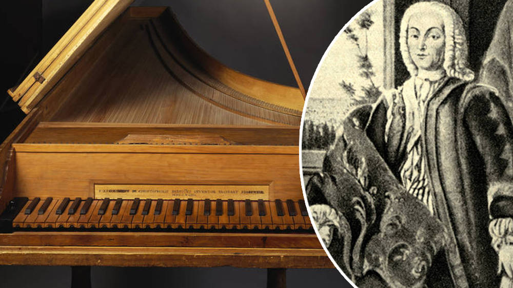
2. What did the first piano look like?
Who invented the piano – and why does nobody remember him ...

3.What is the difference between a piano and a keyboard?
The piano is an acoustic instrument, meaning its sound is produced and amplified physically. In comparison, keyboards are electronic instruments with a variety of volume options, and often can produce sounds like piano, horns, strings, organs, synthesizers, and more.

4. What have you enjoyed about learning the piano / keyboard. What have you found challenging
It's really fun learning a new instrument but also I also had a hard time using both my hands on the piano but now I'm used to it.

Wednesday, August 19, 2020

What we have done so far | Digital Technology

 The Work I've done 


For this introduction in DTE, We have learned What code is, Binary and Steganography, The Design Process, Principles, Elements & Relevant Implications, and Ergonomics

What I enjoyed in this introduction is the coding and making our own ergonomics using venngage, what i really enjoyed is Code.org because it's really fun tool to learn which was really fun it taught you how to code.

Thursday, August 13, 2020

Monday, August 3, 2020

Solid Waste

Introduction


The topic I have chosen is called solid waste and it’s about rubbish that causing the landfills and I'm gonna write an essay about the topic I chose. I'm going to describe them and tell whats the impact of or whats the solution and the last one is conclusion for this topic.


Describe


Solid waste is the number one contributor of landfill waste disposal. Homes, schools, restaurants, public places, markets, offices and so on produce a great deal of rubbish, garbage and used materials. Solid waste means any garbage or refuse, sludge from a wastewater treatment plant, water supply treatment plant, or air pollution control facility and other discarded material, resulting from industrial, commercial, mining, and agricultural operations, and from community activities.


Impact


An inefficient solid waste management system may create serious negative environmental impacts like infectious diseases, land and water pollution, obstruction of drains and loss of biodiversity.Waste decomposes may cause pollution. Badly-managed landfill sites may attract vermin or cause litter. Incinerating waste also causes problems, because plastics tend to produce toxic substances, such as dioxins, when they are burnt.


Solution


Converting waste into some new or usable product thereby preventing waste disposal. Landfills are likely to cause air water and land pollution in spite of utmost care taken. I consider it to be a threat to us and hazards are associated with it. Reuse and recycling are the most common methods to reduce landfill waste and the other methods to reduce landfill waste is donate clothes Believe it or not throwing away of clothing is one of the biggest contributions we make to landfills today and reduce food waste food is another item that we often just carelessly toss away without thinking twice about it. Each year, a very large percentage of our purchased food is left uneaten.


Conclusion

My conclusion for this topic is that solid waste is a bad thing because solid waste is the cause of landfills and it’s bad for our health and environment. That means that runoff from landfills, carrying with it toxic chemicals from our waste ends up in our water supplies.


Thursday, July 30, 2020

Music Term 3

Why did you choose music? 
I chose it because I like it.

What would you like to learn in music?
I want to learn more about musical genres.

Do you play an instrument ? For how long? What can you play?
Yes I play the guitar and I have been playing for three years.

Who is your favorite singer/band, why? 
My favorite band is Guns N' Roses because I admire their band especially slash because he has good rhythm skills and his solos are memorable.

Name 5 of your favorite song? 
My favorite songs are Sweet Child O' Mine, You and me, Happiness, Iris and Unwell

Tuesday, July 28, 2020

Workshop 5: Creating the illusion of the other mother

Workshop 5- Creating Characters
1. Physical - soft/round edges
                   - looks like real mum
                   - normal height

    Costume - basic - no patterns
                    - baggy loose clothing
                    - mostly covers body

    Colour/Lighting - warm, artificial light, dull
                               - colour palette - orange
 
2. Physical - sharper edges-head/nose/apron

                   - patterns on outfit
    Costume - blacks / red
                   - loose / baggy gives idea of softness

    Colour/Lighting - warm artificial,
                                 orange / yellow

3. Physical - paler skin
                   - weight shift to hips/bum - accents beetle.
                   - pointing nose, back of the head, elbows Skinner

    Costume - pattern- polka dots, black, white, red
                   - fits her figure better
                   - beetle shell like layers.
                   - show more skin

    Colour/Lighting - bright, vibrant, cold, artificial - browns / peaches
 
4. Physical - stick figure - lost all the fat
                     taller, long neck
                     hair, back of head, arms, elbows, back of dress.
     
     Costume - pattern-black, white, red
                    - shows more skin
                    - a lot tighter 
                    - beetle shape on the back and collar
   
      Colour / Lighting - bright, warm, artificial, oranges

5. Physical - ugly spider like, needles, not fat, no skin,
                   - lots of sharp angles - head, joints
                   - taller
        
    Costume - tattered rags, barely three
   
    Colour / Lighting - green / black, cold light, unnatural.


Tuesday, July 21, 2020

Workshop 4: How does Music enhance the story

Music

Diegetic  Sound - sounds added to a scene eg music

Non - Diegetic Sound - sounds that happen naturally in a scene eg footsteps, wind blowing leaves.

Chords - Major - written in a major key, has happy uplifting tone.
             
               Minor - written in a minor key, has a sad, gloomy, morose tone.

Tempo - fast - could walk quickly to make music feel energetic, gives movement/pace
speed     moderate - mix of two
              slow -dragging feet pace, makes music feel lethargic, boring, energy, locking, sleepy

Dynamics - Loud (fate)-gets viewer attention enhances emotional/mood - makes happy happier etc
volume       Quiet (piano) either background noise or used to make viewer focus
                   Charging - quiet-loud - builds intensity
                                      loud-quiet - clows focus

Music
           Opening scene
Chords- minor has a sad vibe, feels creepy, unsettling

Tempo- moderate- feel on edge, walking pace, gives energy

Dynamics- changing- starts quiet, get louder, grabs our attention, builds emotion and intensity

Mouse Circus

Chords-  minor - is very upbeat and energetic but minor tone make it feel off/uncomfortable

Tempo-fast - gives us upbeat, wont to move energy,makes the circus feel fun and lively

Dynamics- loud - makes viewer feel hyped up energetic, invited to join in.

Thursday, July 2, 2020

Sustainability

What we learned so far In our sustainability hurumanu is we studied on the problems of the earth and our current problems including the overpopulation to covid-19. We also studied up on how this happens and how to prevent it. We also studied up things to put stop to it, Slow it down and prevent it from happening or how to not get infected.

Also we had to do some games with dragon cards, it was fun as well after we got the hang of how to play. We were in groups of 2-4 with class mates, or just our friends. The card game was sort of challenging but it was also a good game to play.  Here's also a pic of what the dragon cards look like:


The 3rd work we did in class was called natural resources sustainability. 
That's a picture of 2 work things we did for natural resources, the 2nd bit was a bit hard figuring out where the words match with the sentences on the opposite side. for one point we had to ( with whole class) we all had a choose to agree or disagree for a statement that was said by Mr Carter, including money and one other thing that i cannot remember what it is. 

The next thing after that we did was paragraphing. We used these cards called 8 handy paragraphs/structure and another card called 12 ways to write a paragraph. It was helpful to help us write a paragraph. So after that we had to do our own paragraphs, for me it was a bit hard, so i only got 2 paragraphs done and including the other one that we did with the teacher.


for the last thing we did was called measurement for maths, We started off on mathletics after Mr Carter was explaining some things to the class. It was quick fun doing mathletics for some reason i enjoy doing it.
So that's all I did so far

Tuesday, June 30, 2020

Workshop 3: How does 'Lighting and Colour' enhance the story

Atmosphere - feel in a space,energy around you.
Mood - how you feel.
Location - place something is happening.

Lighting  -  natural - light that comes from nature - sun, moon, stars, lighting, fire
                   artificial - man made light source - electricity, light bulbs.
               
                   warm light - yellow/orange tone
                   cold light - blue/white tone - clean/clinical
    
                  bright - fills the space
                  dull - fills part of the space faded.

Colour - Colour palette - what are the predominant colour used.
                 
                  warm colours - welcoming, happy, friendly
                  cold colours - make us feel sad, lonely, chilly
                                      - clean, clinical

Brainstorm:  Lighting/Colour

What is happening - Coraline and her family having breakfast in the real kitchen
                               -  look rushed, tired

Describe Lighting - natural light - clouds through window
                                cold - white tone
                                bright - whole space bright
               
                Colour  -  white, yellowish, cream - old
                             -  cold - makes space feel tired.

Effects on Viewer - boring, dull, sad
 ( feel/think)          - understand they are not a happy family
                             - Coraline unhappy.

Director Purpose - makes other world more appealing
                            - Coraline doesn't like the real world

Other techniques - Setting - outside window is cloudy and grey
angle/shots, music,            - furniture looks old and run down
costume, make up,            - doesn't feel lived - empty.
  setting
What is happening - coraline and Other Parents eating dinner in the other kitchen
                               - everyone seems happy

Describe -  Lighting - artificial - ceiling light
                                   warm - yellow/orange tone
                                   dull - some space dark
                  
                   Colour - red, orange, white, black
                               - warm - happy, safe, welcome

Effect on Viewer - compact/close, interesting, welcoming, safe
(feel/think)           - Coraline is happy to be there
 Director Purpose - Shows theme looks can be deceiving because Other family look kind
     (Theme)             and happy but actually evil.

Other techniques - Costume - formal, fashionable, fit better,
angle/shots, music,            - furniture looks old and run down
costume, make up,            - doesn't feel lived - empty.
  setting


Friday, June 26, 2020

Music Genre Study Reflection


Our task for Music was to pick a Genre that we were interested in, and then were set to do research about this specific Genre and find out about its history. In my group were Nate, Tiaoa, Miah and I who decided to do Pop as our Genre. We chose to do this Genre because as you know, most well known Singers around the world are Pop Singers and wanted to find what was so special about Pop. Something I learnt that was new for me is that Pop was the Genre known for producing most's hits. Most Pop songs share a certain thing called the Pop - Music Formula, because they all have a good rhythm, a catchy melody and are always at ease to remember and sing along to. 


SlideShow Link: https: https://docs.google.com/presentation/d/1KfDFdE-G2-0WcEznWV2uLqjP5n0JPwo8zCl9CX6hMHI/edit#slide=id.g81e3dc912a_0_420

Tuesday, June 23, 2020

Workshop 2: Linking theme to the impact on Angles, Movement and Shots

Brainstorm:
                                                    Other 

What is happening in this shot - Whybie standing on stairs outside house. Other mother ask him to 
                                                   smile from doorway, instead he frowns.
                                                   - Other Whybie making smaller- less of a target-head down,
                                                     Shoulders hunched looks week and vulnerable.

Angle/shot used - High angles - make Whybie look overpowered, week and vulnerable
                     
                             POV - Other Mothers makes her seem stronger, bigger, more dominant     
  • Viewer - makes viewer feel sorry for / scared for Other Whybie.                                                                   foreshadowing - hinting at whats is to come.
  • Director - Hinting that maybe the Other mother isn't wonderful.
  • Other techniques - Spotlight or Whybie - likes he's on the spot/under focus                               -                                - dark around creates a creepy atmosphere
In the scene with the Other Mother and the Other Whybie we see high angle shots used to show the theme 'looks can be deceiving' We see this when the Other mother ask the Other Whybie to smile but he hunches over and frowns instead. This make the audience feel sorry for Other Whybie because he looks scared. The use of a high angle shot from the perspective of the Other Mother adds to this feeling as it makes the Other Whybie  look week and wearable. The director did this to foreshadow the change of the Other Mother from creepy to more creepy. Coinciding with this is the use of lighting. A spotlight is on the Other Whybie emphasizing that that he is under the focus of the Other Mother. This reminds us earlier in the film where a low angle shot was just ordinary. This links to the scene because it also shows a moment when the look of a character was deceiving 

Tuesday, June 16, 2020

Workshop 1: Unpacking Themes and Ideas.

Theme and Ideas - continuous idea/subject that links throughout the text.

Looks can be deceiving - don't judge a book by it's cover
                                       - don't judge by appearance
Example 1 : Character of Wybie - when we first meet him he seems sorry (mask,motorbike use of high angle to look bigger, loud music) but in reality he just a weird neighborhood.

Show theme because like other characters, our first impression based an appearance, tone, visual techniques aren't correct.

Important because helps audience understand with Caroline that just because something looks good doesn't mean it is she should choose the real world over the other world.

Example 2: Character of the other mother - she seems normal/friendly at the start but by the end becomes a soul devouring spider demon.

Show themes because other mother isn't what she appears to be at the start so we shouldn't judge by first impressions.

Important because Coraline realizes that having something that looks perfect isn't always a good thing.

Statement - In Coraline, the theme looks can be deceiving is used effectively to engage the audience.

Evidence - For instance, the character of the other mother shows us that looks can be deceiving because she start off as a kind mother figure but gradually changes into a soul devouring demon

Explanation audience - This makes us understand that we shouldn't judge a character based on first impression as they can often be wrong.

Explanation director - This is done to help Coraline decide between the real world and the other world. if the other mother was really perfect Coraline choose to go home.

Explanation another technique - Combined with this is the use of colour and lighting. the other mother first appears in a vibrantly bright room that makes us feel warm and safe. however by the end it has become dark and green which makes viewer feel scared and shows that her first look was deceiving.

Your link - This can be juxtaposed to the character of Wybie who we think at first is evil but actually kind, proving looks can be deceiving.